Some times ago i try to work with ...\gfx\... folder
like this decals.bmp
Do you have any ideas and suggestions for improving this sprite?
You can try this sprite by yourself - save it to folder ...\gfx\... and rename as decal.bmp
I am a bit do not understand where and how a game use some sprites.
Like as snow steps or legs - sometimes it seems to me that there are no rules in game code of using this sprites and it used randomly.
I think they look really ugly.
I like the concept, though. Use the art style of CS2D and use your realistic player postures, and it will be better.
Also, the CT's should be holding their guns on their shoulders while T's should be holding them on their hips just like in the real CS series.
In original CS 1.6 position of weapons in player hands is different for each weapon.
For example, for AK47 or Galil all models are from waist, and most other rifles from shoulder.
For top down view as CS2D used, it is difficult to realize. At the this moment, rendering image of weapon skin create it over player skin.
So let's say - all weapons skins currently used in position "from shoulder".
I can draw weapon skin without butt and with correct shadow on it from body - and this method is simulating position of using weapon from waist.
At this point player skin is only one whole image(sprite), and it does not consist of multiple images or frames - therefore, it can not have different non-standard or realistic animations.
Besides drawing order of images is not possible to change:
Firstly game drawn map and its images, then it added a player with its skins(legs and then player), player equip weapons.
In this embodiment, image that is later drawn above images that are earlier drawn.
I like realism style, and i don't like comic style of standart CS2D. At all screenshots of my files and mods you can see how CS2D looks with realistic style skins.
What is its terrible?
What exactly is it?
I try to make weapons of appropriate size real-world counterparts, and based on laws of Vitruvian Man, and try to scale it by pixels.
So 1 real meter ~= 27,5 pixels
Like example:
My m4a1 is more longer as ak47 .. as it is in real world.
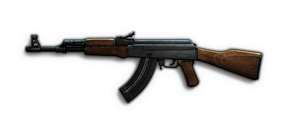
@ Pagyra: I mean look at the drop, for example, your ak47_d. Look at that mag? You like realism? then fix your guns.
I know i sound rude, i know it's not finished yet, but please, finish this. I'm serious.
Look at the ak47_d you got : wierd stock, weird magazine and realistically kiddie colour pallet and colour that dont matches with the buy image. Catch my drift?
look at the colour of the goddamn gun for freaking sakes, does it look proportional than the real ak47? I dont think so. And the colour of all _d images looks unrealistic. If you want realistic then make the colour proportional to the _m image.
If you mean CSO Buymenu images (3D&Flat Style) (13) - then I absolutely do not care about buy image _m - those images are ported from Counter-Strike Online.At the moment I'm only interested "in hands" image and "drop" _d image.
Any good image can be used as buy image:
Just make the drop images look rustic, darker and bolder. And the shapes, make it look sexier and realistic. What i mean of rustic is old, worn and battle torn shit. End of arguement.
PS: I am currently using a mobile device. I cant give you a comparison.