Forum

> > Projects > Stranded III Dev. Blog
Forums overviewProjects overviewLog in to reply

English Stranded III Dev. Blog

114 replies
Page
To the start Previous 1 2 3 4 5 6 Next To the start

old Particle Effects

DC
Admin Off Offline

Quote
Particle Effects
I've worked on particle effects. Not only the particles themselves but also systems around them. You can now define effects which consist of particles and sounds (both optional - it can also be just sounds or just particles) in Stranded III. These effects can either be specified in other places e.g. the effect that is played if someone steps on or hits a specific material or they can be spawned at will via Lua scripts. The system uses pooling so effects don't have to be re-instantiated all the time (= better performance).

I've also drawn my own particle sprite sheet. The advantage of having multiple sprites in one single texture is that you only need one material for all your particle effects. This reduces rendering overhead if multiple particle effects are visible at the same time. Okay, well.. in reality I need glowing and non-glowing sprites etc. so I have to use different shaders and therefore it's not just one material. Using the sheet improves performance nevertheless.

That's what the sheet looks like right now. There's still enough room for additional effects!
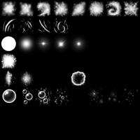
IMG:https://stuff.unrealsoftware.de/pics/s3dev/particlesheet_pre.jpg

> Click for bigger version


I was quite scepticale when I started using Unity's particle system. Before that I was used to entirely programming particle effects on my own. That's how I did it in all my previous games. The advantage of programming particle effects is that you can do whatever you want. There are absolutely no limitations.

Coming from this approach with unlimited possibilities I was sure that the Unity particle system, which uses a (big) set of settings, would limit me and my creativity a lot. Luckily I did not spot any major limitations yet. Kudos Unity! That particle stuff is actually quite nice and allows to create complex effects. The best part is that you can instantly see your changes which massively reduces iteration times. When I programmed particle effects I had to recompile my projects all the time to see what my adjustments look like.

Here are some of the effects I made. Note that these are just first attempts and that I may (or may not) improve them later.
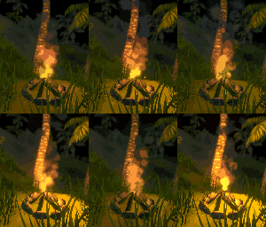
IMG:https://stuff.unrealsoftware.de/pics/s3dev/fire_pre.gif

> Click for bigger version

If you look carefully you can see that the're even bouncing fire sparks with collision (just one visible in this gif)!

IMG:https://stuff.unrealsoftware.de/pics/s3dev/bubbles_pre.gif

> Click for bigger version


Resarch & Recommendation: Subnautica
I started (and finished) playing Subnautica. Of course primarily for research purposes
It has two major things in common with Stranded III:
1. it's a 3D first person survival game
2. it's made with Unity

If you didn't play Subnautica yet I can highly recommend to give it a try. I got it for free on Epic store some time ago but it's also worth the money. It's super fun to explore the world and it doesn't get boring because events and new crafting abilities keep you entertained.

old Website, Icons & IDs in Lua

DC
Admin Off Offline

Quote
Responsive Website
Stranded3.com is now responsive and works better on mobile phones. This is something I planned to do for all my pages this year. It's not 100% finished though and I may change a few things in future.

Equipment Icons
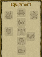
I've drawn new equipment icons which better match the building category icons. That means: doodle style stuff.
IMG:https://stuff.unrealsoftware.de/pics/s3dev/ui/equipment_pre.jpg

> Click for bigger version


Automatically Generated Icons
Items in the game can either use images as icons for the inventory or the game can automatically render icons from the 3D models. Automatic rendering can be adjusted with some definition settings to make the items look better. I now made a simple hacky dialog which helps to find the right definition values:
IMG:https://stuff.unrealsoftware.de/pics/s3dev/ui/iconmenu_pre.jpg

> Click for bigger version


Technical Stuff: IDs & Lua
Stranded III is using string identifiers to make things more mod- and script-friendly. Internally however it's working with integer identifiers and references/pointers because they consume less memory and are processed much faster.
When writing Lua scripts you can now benefit from the best of both of these worlds. You can use string identifiers (which will automatically be converted to the internal identifiers) or you can use the internal identifiers.

This script will get the internal identifier for the "log" entity definition:
1
log = entityDefinition.get("log")
Retrieving the identifier once and using it multiple times in subsequent script parts will be slightly faster than using the string identifier all the time. That's because each time you're using the string identifier, Stranded III will have to do a hash map lookup (it's actually a C# dictionary). If you get the identifier once and reuse it, there will be only one lookup.

Simple, unoptimized approach (100 hash map lookups):
1
2
3
for i=1,100 do
	entity.spawnOnGround("log", math.random(-50,50), math.random(-50,50))
end

Optimized approach with cached identifier (1 hash map lookup):
1
2
3
4
logId = entityDefinition.get("log")
for i=1,100 do
	entity.spawnOnGround(logId, math.random(-50,50), math.random(-50,50))
end

This is a micro optimization though and in allmost all cases it's probably easier to just stick with strings. It's just nice to have the possibility to use less of these slow and nasty strings.

old Let's Dither!

DC
Admin Off Offline

Quote
Advent
Advent is coming! First candle is on! Hooray!
IMG:https://stuff.unrealsoftware.de/pics/s3dev/advent1.png

Wow! I even painted 2D candles on that 3D lifebuoy! That looks... uh. Whatever! Christmas! Santa! Hey!
Okay.. now prepare for some technical stuff! Fun Fun Fun!

Technical Stuff: Dithering
Dithering is a technique which "fakes" color detail by smartly painting pixels in only few different colors.
One common use case is image compression which works with color palettes. The advantage of palettes is that you don't have to save red, green and blue (and possibly alpha) color information per pixel. Instead you just create a palette with all colors used in the image and then you just save the palette index pointing to that color for each pixel.
In best case this requires much less memory per pixel.
To make that approach efficient the palette must be as small as possible though.
Firstly because the palette itself needs to be saved as well and secondly because the data required for each pixel grows with the size of colors in the palette.
Dithering can be used to reduce the amount of colors in the image. You can for instance create a fake orange by making every even pixel yellow and every odd pixel red. With more sophisticated patterns you can even fake color gradients using just 2 colors.

Fake Transparency With Dithering
A different use case for dithering is faking transparency. It basically works the same way. If you want an image to look transparent you just skip some pixels using a pattern. The more transparent the image is the more pixels are skipped when rendering it.

But Why?
Why would you want to do that though? I mean dithering is visible and looks worse than using more colors / mixing pixels to calculate proper transparency.
The answer is simple: Speed!
When rendering 3D scenes real transparency is quite expensive and costs a lot of performance. The reason for this is they way a 3D scene is rendered. The GPU creates a Z-Buffer which calculates the depth of 3D objects in the scene and is used to determine what to render and in which order. That way the GPU can quickly skip rendering of pixels of objects which are occluded by other objects in front of them. Transparent objects however don't work with that approach because their color has to be mixed with objects behind them. They kind of break the Z-Buffer rendering approach. In Unity transparency can also have a negative impact on batching which can also decrease performance. Fake transparency with dithering dodges these problem because there are no semitransparent pixels anymore which need to be mixed.

Can I Dither In Unity?
Because of the stuff explained above I want to use dithering for transparency! Especially for showing/hiding objects which are far away. I want these to fade in/out smoothly instead of suddenly popping in and out.
Unity supports dithering but there is no proper documentation for that feature and I had to search a lot to make it work. Unity can use dithering for LOD crossfading but all used shaders need to be properly adjusted to support it. At the bottom of the "LOD Group" documentation page we see the variable which controls the transparency: unity_LODFade. So we don't have to use the "LOD Group"-component to make it work (and I don't want to use it for some reasons). We just have to set the unity_LODFade value in all used shaders/renderers to control their fading/transparency value.
Luckily I found this forum post which explains how to do it. Hooray!
1
2
3
4
5
6
7
8
9
10
//Call inside Start()
rend.sharedMaterial.EnableKeyword("LOD_FADE_CROSSFADE");
 
// Coroutine/Lerp this
Vector4 fadeOutVec = new Vector4(tFadeOut, tFadeOut);
block.SetVector("unity_LODFade", fadeOutVec);
rend.SetPropertyBlock(block); // Blocks can be pooled
 
// Call this one frame after tFadeOut == 0, this will cause static batching to work again
rend.SetPropertyBlock(null);
(code taken from the posted linked above. Posted by sewy. Thanks for that!)

That post also mentions how shaders need to be adjusted for that dither crossfade fun but the explanation isn't very detailed. A better explanation for shader adjustment can be found in this post. Furthermore in that post there's a link to a simple shader which supports dithered transparency / crossfading. It's great for reference and to get started and helped me to adjust other existing shaders to also support dithered transparency.

Optimizations
The code snippet above says in a comment that the ProperyBlocks can be pooled.
In fact you don't even need real pooling there. You can just create one PropertyBlock for each transparency level and use those as often as you want to. This is also what the documentation suggests:
Quote
The block passed to Graphics.DrawMesh or Renderer.SetPropertyBlock is copied, so the most efficient way of using it is to create one block and reuse it for all DrawMesh calls.

Actually they even suggest to only use one PropertyBlock for everything. I want to skip the overhead of changing the fade value however so I guess my approach is fine too.
I somewhere read that Unity's dither pattern has 16 levels so I prepared my PropertyBlocks this way:
1
2
3
4
5
6
7
8
9
readonly int LodFadeNameID = Shader.PropertyToID("unity_LODFade");
var propBlocks = new MaterialPropertyBlock[16];
for (int i = 0; i < 16; i++)
{
	propBlocks[i] = new MaterialPropertyBlock();
	float fadeValue = (i + 1) / 16f;
	Vector4 fade = new Vector4(fadeValue, fadeValue);
	propBlocks[i].SetVector(LodFadeNameID, fade);
}
Also note that I used Shader.PropertyToID because using strings is always bad. (okay... it doesn't really matter in a loop with only 16 iterations which is just called once but whatever)

Now to set the transparency of an object the following needs to be done:
1
2
3
4
5
6
7
8
9
10
11
12
13
14
// Enable crossfade keyword, only needs to be done once
// (Maybe this doesn't need to be done at runtime at all? Further research required!)
var renderers = GetComponentsInChildren<Renderer>(true);
foreach (var renderer in renderers)
{
	renderer.sharedMaterial.EnableKeyword("LOD_FADE_CROSSFADE");
}

// Set transparency (assuming that transparency is a float from 0.0 to 1.0)
int index = Mathf.Clamp(Mathf.RoundToInt(transparency * 15f), 0, 15);
foreach (var renderer in renderers)
{
	renderer.SetPropertyBlock(propBlocks[index]);
}
All this code is just an example. It's not 1:1 the code I'm using in Stranded III. The renderers for instance should be cached because GetComponentsInChildren isn't very fast.

Also when the transparency is back to 1 (fully opaque) the PropertyBlock should be unset. That's because using a different material block breaks Unity's batching and therefore can have a negative impact on rendering performance.
1
2
3
4
foreach (var renderer in renderers)
{
	renderer.SetPropertyBlock(null);
}

Whew! That was a long one!

Not sure if this is helpful to anyone but I think it's a very important and useful thing which is why I wanted to write it down.

Here's what it looks like (in the big version you can even see the dither pattern):
IMG:https://stuff.unrealsoftware.de/pics/s3dev/ditherfade_pre.gif

> Click for bigger version (2.6 mb)


btw: The compression of that gif is probably one of the best examples for color palettes and dithering!

btw²: Dithering can be seen in a lot of games. So now you know why. It's all about performance (oh and sometimes it also prevents some ugly rendering/sorting issues which can occur with real transparency)
edited 1×, last 28.11.21 10:30:49 pm

old Monstera

DC
Admin Off Offline

Quote
Advent II
Advent is here! Second candle is on fire!
IMG:https://stuff.unrealsoftware.de/pics/s3dev/advent2.png


Monstera
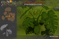
Let's welcome a new plant to the Stranded III family: The Monstera! Monsteras are pretty easy to recognize because of their funny leaves which can have holes and slits. That unique look also makes it a sought-after house plant.
IMG:https://stuff.unrealsoftware.de/pics/s3dev/models/monstera_pre.jpg

> Click for bigger version


I plan to make a climbing plant version later which can not only grow on the ground but also on trees, rocks etc.
Monsteras can actually yield edible fruits but I'm not sure yet if this will make it into the game.

... and that's it for today. Sorry. I had to make a post for the second candle and that's all I have to show right now

old Clusters & Wind Sway Intensity

DC
Admin Off Offline

Quote
Advent IV
Three candles! Wait! No, it's four already! Looks like someone totally didn't manage to write a blog post in time! Oops!
IMG:https://stuff.unrealsoftware.de/pics/s3dev/advent4.png


Procedual Map Generation: Clusters
In real landscapes you often see clusters of plants. That's why I thought it would be nice to support clusters in the procedual map generation for Stranded III as well.
This is how you define stuff which should be spawned inside a biome:
1
2
3
4
entitySpawner {
	entityPattern = ^fern
	block = 1
}
entityPattern defines a regular expression which is used to find matching entities. In this case all entities with IDs starting with (that's what the ^ stands for) "fern" will be included. You can also manually define single or multiple entities for an entitySpawner. block says that the field (1x1 meter = 1m²) the entity is spawned on will be blocked and not be used to spawn any other entities. Higher values than 1 can be used to also block surrounding fields.
This is just a single entitySpawner. You can have as many of these as you want (per biome) and they also have many more settings like weights/ratios, terrain height and steepness etc.

A couple of additional new settings comes with the cluster feature I now implemented. Of course these only have to be set if you want to use the cluster system. Here is a cluster example. It's the above fern stuff with extra cluster settings:
1
2
3
4
5
6
7
entitySpawner {
	entityPattern = ^fern
	block = 1
	clusterCount = 4,5
	clusterRadius = 3,4
	clusterMinDistance = 0.75
}
clusterCount is a random range which says how many ferns the game should try to spawn per cluster. In this example it will always be 4 to 5 as opposed to the previous example where it will always be one solitary fern. In some cases the clusters may have less ferns e.g. if there is not enough space.
clusterRadius is also a random range. It defines the radius of the cluster. In this case 3 to 4 meters. So here 4 to 5 ferns will be spawned within a radius of 3 to 4 meters.
clusterMinDistance defines the minimum distance between objects. All ferns within this cluster will have a distance of at least 0.75 meters to each other. In general the Stranded III procedual map generation uses a 1x1 meter grid and the above mentioned blocking system. So there's only max 1 entity per m² (if block = 1 is used). Clusters allow more dense placement and this is why there is this min distance setting. It helps to reduce ugly overlapping of entities within clusters. Note however that this entitySpawner also has block set to 1. So all 1x1 meter fields which contain a fern will be blocked for other entities. The blocking will only be applied AFTER spawning all cluster entities so they don't block each other. Otherwise it would not be possible to have higher densities in clusters while also using the blocking system.

Shader: Wind Sway
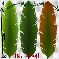
One of my goals in Stranded III is to have a fast and simple asset creation pipeline. Otherwise content creation would simply take too long. One example for this is that foliage of plants should sway in the wind. I don't want to invest additional time for each 3D model to make that work. Therefore I'm using a shader which uses the UV-coordinates for wind sway effects. On the bottom of the texture there's no swaying. On the top there's maximum swaying. So when creating new textures you only have to care about proper orientation and placement of shaking things in thex texture. When creating new models you only have to choose the right shader to make shaking work properly! Hooray
This is what textures using this shader commonly look like:
IMG:https://stuff.unrealsoftware.de/pics/s3dev/swayshader_y_pre.jpg

> Texture with swaying based on Y-coordinate. Click for bigger version


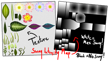
In many cases however I want to store a lot of swaying stuff in a single texture. Using the Y-coordinate for swaying intensity limits me a lot when arranging stuff inside the texture. Therefore I made an additional shader. It comes with a second texture which contains the sway intensity. It's a bit more work to create textures for this shader because I need that additional texture with sway intensities. It allows me to optmize stuff better and to make better use of texture space though. Here's an example of a texture and the sway intensity texture:
IMG:https://stuff.unrealsoftware.de/pics/s3dev/swayshader_tex_pre.png

> Texture & matching sway intensity texture. Click for bigger version


To make that shader work I had to access the sway texture inside the vertex shader. I didn't know that this was possible but luckily it is (unless you're using an old shader model). I found this thread which describes how to do it in Unity. At first it seemed like it didn't work properly because some of my leaves didn't sway as expected. Turned out that I had to set the "wrap mode" to "clamp" for the sway intensity texture. That fixed my issues!

old Jumping Chicken!

DC
Admin Off Offline

Quote
UI Changes
Making the UI user-friendly is quite a challenging task. Therefore I'm changing it a lot to find a layout that works well.

Originally I wanted the buttons for different in-game menus (backpack, crafting, construction, diary, ...) to be on the left. I now decided to move them to the top. That allows me to show in-game messages on the left side on the screen and they are even visible and easily readable while a menu is open.

I also realized that putting information texts above the crosshair is a really bad idea because a lot of the view is obstructed that way. Therefore I now moved all crosshair context information (such as the name of the thing you're pointing at and possible actions) below the crosshair.

Optimized Map "Files"
I decided to no longer save maps (and savegames) in a single file. Instead each map and savegame will be a folder with several files: A header file with general information about the map, a preview image file and one file for each chunk. This allows me to make saving much faster. This is especially important for quicksaves which should be as fast as possible. When you overwrite an existing save, only the header, the preview image (a screenshot of the current scene) and the MODIFIED chunks will be written. Chunks which did not change at all since the last save won't be touched.

This optimization comes with two downsides:
× It's more annoying to share maps and savegames because you have to share a complete folder and not just a single file
× The operating system has to access many files when loading/saving maps

The first downside is not a big one in my opinion. There might be more room for mistakes this way but once you know how it works it should be fine.
The second one can actually have negative impact on performance. Accessing files comes with some operating system overhead. Moreover the files might be stored in different memory sectors in chaotic order which leads to slower access times. This can make quite a difference on HDDs but if you store stuff on SSDs the impact isn't that big. Overall the benefits outweigh the downsides and most importantly this can significantly reduce load and save times on large maps.

Jumping Chicken
This (Attention: 8mb gif!) is what you get when your raycast and movement code doesn't work as expected. Fun. I only wanted them to move on the ground. Making them jitter like crazy wasn't part of the plan.

Research: Subnautica Below Zero
Another "research" project: Subnautica Below Zero! I already mentioned the predecessor in July last year (Dev Blog 101). Below Zero is a great game as well. Get it and play it if you like survival and exploration stuff!

old Bread & Foliage

DC
Admin Off Offline

Quote
Bread
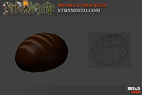
I made a new bread model because I never liked the one I made quite a while ago.
Here's the old one:
IMG:https://stuff.unrealsoftware.de/pics/s3dev/models/bread_pre.jpg

> old ugly bread model


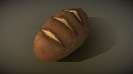
And this is the new one:
IMG:https://stuff.unrealsoftware.de/pics/s3dev/models/bread_new.jpg

> amazing new bread model @ Sketchfab

Some UVs/normals look a bit broken on Sketchfab for some reason but no worries - it looks fine in-game!


Ground Foliage
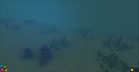
I worked a lot on ground foliage which is automatically rendered by the game on the terrain depending on texture and altitude (and your settings - you can disable most of it for better performance). There's now underwater plant stuff for instance:
IMG:https://stuff.unrealsoftware.de/pics/s3dev/terrain/groundfoliage_underwater_pre.jpg

> Underwater ground foliage. Click for bigger version


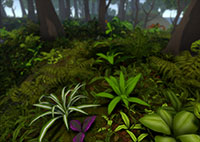
Fallen leaves have been added to the jungle foliage. Moreover there are some new plant models (which are not part of the automatically rendered ground foliage but need to be placed either manually or by the procedual map generator).
IMG:https://stuff.unrealsoftware.de/pics/s3dev/terrain/groundfoliage_jungle_pre.jpg

> Jungle ground foliage. Click for bigger version


I still need to add more mossy stuff and trees with more lianas and climbing plants to make the jungle biome feel more like jungle.

Category Tabs
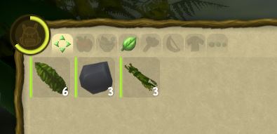
This is just a tiny detail but I'm now graying out item category tabs in the backpack (and other containers) if there are no items of that categeory. This can save the player a pointless click.
IMG:https://stuff.unrealsoftware.de/pics/s3dev/ui/category_tab_grayout.jpg

(the first tab is the "show all categories"-tab)

old Editor Stuff: Transform, Outlines, Color Picker

DC
Admin Off Offline

Quote
Having a nice map editor in the game which allows you to - of course - easily create maps is super important to me. Therefore I've put a lot of time into the map editor recently. Here are some of the things I did.

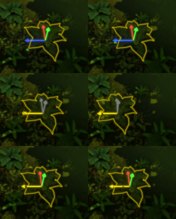
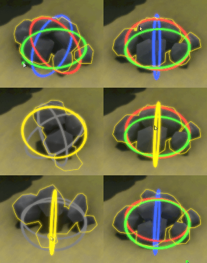
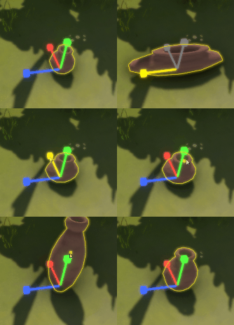
Transform Gizmos
I modelled my own 3D transform gizmo meshes (yes, I'm talking about arrows and circles here) and programmed the logic which allows you to move, rotate and scale objects in the editor. Actually big parts (mainly the math) is "inspired by" (stolen) from existing projects on GitHub like pshtif/RuntimeTransformHandle. Thanks a lot for that!

You can move stuff. By default most objects are locked to the ground and they will stay there when you move them along the X- or Z-axis. If you however move them along the Y-axis (up/down), that "lock to terrain surface"-flag will be removed and you can move them to any height you want. There's also a button to toggle that ground lock behavior on and off per object.
IMG:https://stuff.unrealsoftware.de/pics/s3dev/editor/transform_pos.gif


Objects can also be rotated. Most objects will automatically align their rotation to the ground (if ground locking is enabled) so only manually rotating them around the Y-axis makes sense - at least if you want them to be still aligned to the ground properly. You can however freely rotate around all axes if you really want to.
IMG:https://stuff.unrealsoftware.de/pics/s3dev/editor/transform_rot.gif


Last but not least you can also scale things. This is even possible along individual axes like shown in the following Gif. You can also use a uniform scale along all axes to just make the whole thing bigger or smaller without skewing its proportions in weird ways. Actually that's probably what you'll want to do most of the time.
IMG:https://stuff.unrealsoftware.de/pics/s3dev/editor/transform_scale.gif


Selection Outlines
A small detail: I added fancy outlines to the editor. You can see them in the Gifs above. There's an outline for the currently selected object and another one for the object you currently hover. To achieve these fancy outlines I made use of the fantastic work by Ben Golus. Here's his nice article about that topic. His implementation looks really nice and is also quite flexible. One cool thing is that you can pass in any number of render components (visible objects) which will then get one single combined outline.

Gotta pick 'em all! - Color Picker
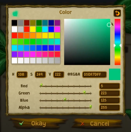
Yet another thing for the editor is the color picker. I might also use it in-game if there's anything which requires/allows the player to choose a color. My color picker is a combination of the Adobe Photoshop color picker and the Microsoft Paint color picker (which is also the default Windows system color picker I guess).

IMG:https://stuff.unrealsoftware.de/pics/s3dev/editor/colorpicker.png

> Watch the color picker demo video @ YouTube


Choosing a color can be done in many different ways:
• By entering red, green, blue and alpha (transparency) values (0-255) in the input fields
• By entering an HTML/CSS-style hex color like #RRGGBB or #RGB or #RRGGBBAA
• By sliding the red, green, blue and alpha sliders
• By entering hue, saturation and brightness values (HSV)
• By picking a hue from the hue bar (the colorful one on the right) and then adjusting saturation and value with the saturation & value picker (the big rectangle)
• By choosing a color from the color palette (rectangles on the left)

All these methods can be mixed as you like. E.g. you could enter red, green and blue values and then adjust the saturation etc.

Another fancy feature is that you can also right click the colors in the color palette. If you do so the current color will be saved there. This way you can build your own palette. The little arrow on the top right allows you to restore the default color palette.
Currently this is limited to one palette. Maybe I'll add extra buttons to manually load/save different color palettes later.

old Dialog Editor & Cactus Plants

DC
Admin Off Offline

Quote
Editor Entity Side Menu
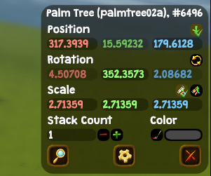
I decided that it's better to have values like position, rotation and scale visible right next to the model so you can instantly see what which values look like in the game world. Therefore I moved them to a little side bar menu. It's visible in the editor as soon as an entity is selected.
IMG:https://stuff.unrealsoftware.de/pics/s3dev/editor/entity_sidebar.jpg


When you change values they will be applied instantly and you see what your changes look like.

Color Override
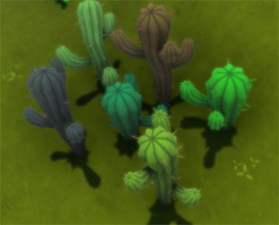
That little menu now also allows to define color overrides per entity. In theory you can give every entity a custom color. Note however that this comes with some performance impact as it breaks Unity's batching (which ultimately leads to a lower framerate). Of course you will also be able to modify entity colors with scripts.
IMG:https://stuff.unrealsoftware.de/pics/s3dev/editor/colored_cactus_plants.jpg

These cactus models here would normally all have the same color but they use the custom color feature! Amazing! (read on for more details about these new models here!)

Dialog Editor
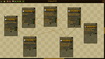
There's a new dialog entity which shows a dialog when it is triggered. In order to allow everyone to easily create dialogs without having to program/script anything I made a visual dialog editor. Oh boy... it took way too long to make that work properly and it's still not finished.
IMG:https://stuff.unrealsoftware.de/pics/s3dev/editor/dialog_editor_pre.jpg

> The dialog editor (with a super deep sample dialog)


You have visual nodes which can be connected with each other. The first node (with that little white flag) is the starting point. When the dialog entity is triggered the dialog will start with that node.
In this sample nearly all nodes are of the type "Entity Dialog" which means that the specified entity will "say" the given text. The game will then automatically point the camera at that entity.
The little boxes below the separator line are the answers the player can choose from. Each answer can also have a condition (hidden behind the equals symbol, not implemented yet) which controls of that answer is available/displayed. When an answer is chosen the dialog will continue with the connected node. When a node has no answers or if an answer has no connected node, the dialog will end.
If you just want to continue with another node without letting the player choose an answer you can also do that by not adding any answers and using the little point at the bottom to set the next node.

There are many different types of nodes. Of course the player can also say stuff. Or it can be a narrative text which is displayed and not said by any specific character. There are also steps without text like conditions, delays, camera movements, starting/stopping music loops etc. Each node can also play audio and run Lua scripts.

Texts in the dialog editor can either be plain texts or text IDs from the localization system if you want to design localized dialogs which work in multiple languages. In case you're using text IDs the editor provides auto completion so you can quickly find and enter the right IDs.
Also if you choose an audio file which is inside a language directory, the game will automatically resolve that and use the matching audio file of the currently selected language.

I think this little editor is a pretty decent system for small to medium dialogs. As soon as stuff gets more complex it's probably quite cumbersome. That's the nature of these graph/node based systems. They can be chaotic and confusing when they get large. Luckily you will also be able to create interactive dialogs entirely via Lua scripting so you don't have to mess with this visual dialog editor at all if you don't want to.


Cactus
I don't want desert biomes to be just empty areas with sand in Stranded III. That would be boring.
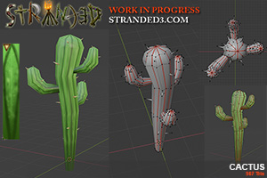
So I made some cactus plants! Yay! The art is heavily inspired by the cactus plants in Fortnite.
There are the generic standard cactus plants...
IMG:https://stuff.unrealsoftware.de/pics/s3dev/models/cactus_pre.jpg

> Cactus


> Cactus on Sketchfab

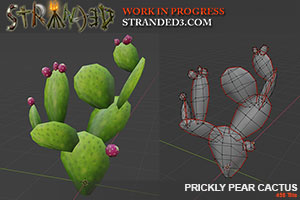
...but also fancy prickly pear cactus plants. You'll probably be able to grow those yourself and you can even harvest the prickly pears:
IMG:https://stuff.unrealsoftware.de/pics/s3dev/models/prickly_pear_cactus_pre.jpg

> Prickly Pear Cactus


One funny idea I had with these is that you might get a some damage and puncture wounds (which may lead to infections if untreated) when you try to harvest the prickly pears without any protection. You would then have to craft some special gloves in some way to mitigate or entirely prevent that damage. Right now that's just a thought and it's not implemented yet. What do you think?

old Various Things & Bamboo

DC
Admin Off Offline

Quote
No Custom Character Controller
In dev blog #99 I mentioned that I wanted to write a custom character controller. Well.. I gave up on that idea. Getting it right is simply too complex and time consuming (and also painful). I decided to go back to the built-in one because it does the basic things (which are actually quite complex) really well. I'll just have to be a bit creative to work around all the issues it comes with.

Making Things More Simple
Complexity isn't always fun and I'm sure that most survival games reduce complexity for that reason.
When testing the game I came accross the problem that when hitting items (lying on the ground) accidentally and picking them up, they will get separate stacks per health value in the inventory. I asked myself if this complexity adds anything to the game. I mean: What's the point of this if health of items doesn't even matter? I could of course make health matter but that's no fun either. People would just throw away damaged items and pick up better ones if possible. That would just add more grind and feel annoying.

Therefore I decided that simple resource items don't have a health value. Items without health also won't have a health bar in the user interface. I'm still unsure what happens when you hit such items. I'll probably make them indestructible in the game world.

All the mechanics are still in the game though. So it's still possible to give every item a health value if you want to. This is important for tools/weapons/armor which lose a little bit of health every time they are used.

Dialog Progress
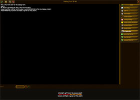
I showed the dialog editor in the previous post and I worked a lot on fine-tuning it and actually displaying the dialogs. You can instantly test and preview your dialogs from the editor, starting at any dialog step you want. Moreover I implemented a lot of tags which can be used in dialog texts. This way you can add delays, effects, colors, sounds etc. at any point in a dialog text. To make it easier to use these tags I made a little dialog text editor which shows a preview of the text and which also offers buttons to easily add tags. Moreover it comes with auto completion for loca keys.
IMG:https://stuff.unrealsoftware.de/pics/s3dev/editor/dialog_text_editor_pre.jpg

> Dialog Text Editor

You also see here that a single dialog step/text can now be split into multiple parts with the <part> tag. The dialog text editor has a little input at the bottom which allows you to choose which part you want to preview.

Localized Media
Stranded III allows you to load sounds, images and texts from files (e.g. in dialogs, entities or script).
If you now put a file in a language folder (containing localization) or any sub folder of a language folder the game will automatically treat the file as a localized file.
This means that it will always try to load the file from the localization folder of the currently active language (the one selected in the game settings). If the file doesn't exist there, it will try to load it from the English localization folder as a fallback. Just a tiny but super useful feature which makes creating localized content easier.

Bamboo Plants
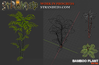
I made several bamboo models for different growth stages. Here's on of them:
IMG:https://stuff.unrealsoftware.de/pics/s3dev/models/bambooplant_pre.jpg

> Bamboo Plant

You can cut down bamboo plants and will be able to build & craft stuff with the bamboo.

Research: Grounded ∗ ∗ ∗
Grounded is absolutely amazing! I already mentioned it in an earlier post (not sure which one) but I didn't play it back then. The full version was released recently and it's included in Xbox Game Pass. The most interesting part of Grounded is probably the new setting. You are a kid that has been shrunken to the size of an insect and the setting is a backyard. You don't log trees but blades of grass and you don't fight big animals but ants, spiders, larvae etc. Your task is to survive and to get back to your original size.
I really like the art style, the stuff you can craft/build and the UI/UX. There's only one huge map (the backyard) but it has a lot of hand-crafted content, various biomes (pond, sandbox, hedge, ...) and a basic but entertaining story line.
An interesting mechanic are the mutations. These are basically perks which are either unlocked over time when doing something often or when completing certain parts of the story or fighting special boss enemies. You can only activate a limited amount of these mutations at the same time though which is kind of cumbersome. I often forget to switch which results in having active mutations which don't help me at all in my current situation.
Except for these mutations character progression is mostly based on the equipment you craft and use/wear and on collectible items which you can use to buy upgrades.
So if you like survival games and didn't play Grounded yet I highly recommend to give it a try! It's one of the best survival games I ever played! https://grounded.obsidian.net/

old Building Placement & Hold-Keys

DC
Admin Off Offline

Quote
Building Placement/Snapping
The building placement & snapping system is now implemented and working. It currently supports 4 modes:
• free: The default. Allows to freely place stuff on the ground with any rotation along the Y-axis. Used for stuff like campfires and storages.
• grid: Stuff is placed in a grid with a specific size. The grid orientation and origin is based on the closest building with the same mode so stuff snaps to the matching grid automatically. If no building is nearby you can place and rotate stuff freely. This is for building parts like walls, floors, roofs etc.
• two points: You define start and end points for buildings. Nearby points snap together. These buildings can scale to some extent to perfectly fill gaps when snapping. This is mainly for fences and defensive walls. It may also be used for water pipes or tracks if I decide to add something like that.
• mounted: Stuff snaps to nearby buildings with a defined logic. E.g. pictures which can only be put on walls etc.

There are various parameters to control the behavior in detail. Moreover it's possible to add extra placement logic and restrictions with Lua.
The same snapping logic is also active by default in the editor when placing buildings / building parts. It can be disabled though.

IMG:https://stuff.unrealsoftware.de/pics/s3dev/build.gif

This gif shows the grid mode which allows to place stuff really quickly and easily. In most cases the building parts even rotate automatically as intended because rotation is coupled with the direction in which you're looking. So all I had to do to build this simple structure is moving around, looking around and clicking. I didn't rotate anything manually.

Hold-Keys
Stranded III now supports keys which need to be held down for a moment (a second) to trigger an action. This is a very common input pattern in games. It has (at least) two cool advantages:
√ It makes it harder to trigger critical actions by accident
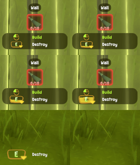
√ It allows to offer 2x the amount of actions with the same amount of keys (as each key can have a press and a hold action)

The first action I used this for is destroying building sites and buildings.
IMG:https://stuff.unrealsoftware.de/pics/s3dev/ui/holdbutton.gif


Transform Gizmos²
I now fully replaced my "own" implementation of transform handles with the great solution by Peter @sHTiF Stefcek (https://github.com/pshtif/RuntimeTransformHandle.)
That's because my own implementation had less features and also some issues and limitations. I had to adjust/extend a few things but now you're also able - for instance - to move objects along 3 or 2 axes at once which can be quite useful. Moreover I can now easily use these handles for everything in the editor and not just entity placement.

old Brushes, Keys, Damage & States

DC
Admin Off Offline

Quote
Terrain Brushes
Someone asked for terrain brushes so I implemented them. Now you can simply use grayscale images as brushes for terrain sculpting and painting. Hooray! Just put your brush images into the right folder and they will become available as brushes in the map editor.
IMG:https://stuff.unrealsoftware.de/pics/s3dev/editor/brushes_pre.jpg

> A rectangular brush used with the painting tool

Fun fact: Brushes use the same format as CS2D spraylogos. 32x32 pixel grayscale images. So you could use spraylogos as terrain brushes

Alternative Keys
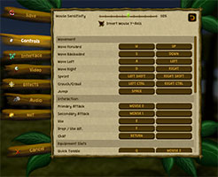
You can now set a primary and a secondary alternative key for each action in the controls menu. This gives me and players more freedom and hopefully I can design a better default input config this way which works for more people. In-game input UI info boxes will still only show the primary key though. Otherwise there would be too much stuff on the screen.
IMG:https://stuff.unrealsoftware.de/pics/s3dev/alt_keys_pre.jpg


Damage System
Stranded I and II just had one simple damage type and no armor/defense value at all. Just plain damage which is applied 1:1.
In Order to make the new clothing/equipment feature in Stranded III more interesting and also to give weapons and enemies more depth there will be different damage types and also different resistance (= armor) types. This means certain weapons will be strong against certain types of enemies and weak against others. The system also applies to other objects so for instance cutting trees by hitting them with arrows will take a while because piercing damage is weak against trees.

The system is entirely data driven and when you mod the game you can add as many damage types as you want. Right now the current damage types are planned but I may remove some or add new ones:
• normal: Regular, unspecified damage
• slash: Caused by sharp stuff like blades (axes, swords, ...)
• piercing: Caused by pointed weapons/projectiles like arrows and spears
• blunt: Hammers, rocks, ...

There are also some more special damage types:
• poison: Poisonous stuff
• fire: Hot stuff
• water: Water. e.g. When hit by a high wave or an elephant spraying water at you
• cold: Ice and other cold things
• electric: Thunderbolts and other electric stuff
• explosive: Caused by explosions
• energy: Energy weapons like laser swords or phasers...
• falling: Only caused when falling from high heights
• smashing: Only caused when hit by large & heavy physics simulation objects

For all these damage types there will be matching resistance and immunity types.
Objects can have multiple damage types and resistances at once. Poisonous arrows for example could cause piercing damage but also poison damage.

When calculating the resistance of the player, the resistance values of all equipped items (clothing) will be summed up and taken into account.

States
I also worked a lot on state (= status effects) logic and also painted some state icons.
IMG:https://stuff.unrealsoftware.de/pics/s3dev/stateicons_pre.jpg

Some of these icons look quite... well... "basic" but this is intended as they'll be quite tiny in-game.
Most of the states are actually bad and express that you have some kind of injury which affects you in a negative way.

States can be Lua scripted as well. They can run actions when they are inflicted, when they expire, when they are removed by something or over time while they are active.

old Lua Editor & Butterflies

DC
Admin Off Offline

Quote
Unity 2022 LTS & URP
I upgraded to Unity 2022 LTS and also wasted - once again - a lot of time trying to switch to URP. I gave up. Unity 2022 works fine but URP doesn't work the way I want it to work. It worked much better than in my last attempt(s) but I didn't get the lighting and some other things right. Also I would have to change a lot of stuff to make it work again. Not worth the effort. I still don't get why Unity decided to switch from one render pipeline to three. It makes everything more complicated and incompatible and is highly annoying. Also the "new" pipelines are STILL lacking some essential features.

Lua Script Editor
There's now an in-game Lua script editor which also features very basic syntax highlighting:
IMG:https://stuff.unrealsoftware.de/pics/s3dev/editor/luaeditor_pre.jpg

> The script editor


Unfortunately there's no syntax check. Anyone any idea how to achieve this with Moonsharp without actually running the script?

Also highlighting is far from perfect. Right now it only highlights known API tables and methods, comments and strings. It doesn't highlight user defined methods or variables. Performance also isn't very good for large scripts. So there's still a lot of room for improvements.

Butterflies
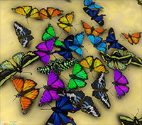
I made some butterflies! There are 5 different hand painted textures which are based on real butterflies. Then I was somewhat lazy and simply made some color variations of the existing textures to get even more butterflies. So in total there are currently 9 different butterflies!
IMG:https://stuff.unrealsoftware.de/pics/s3dev/models/butterflies_pre.jpg

> Colorful butterflies! Yay!

old Flares & Flowers

DC
Admin Off Offline

Quote
The Big Unity F*ck Up
I guess most people who are involved in gaming heard about Unity's runtime fee plans.
This whole thing has left me extremely demotivated. Not because of the additional fees (they probably wouldn't affect me anyway) but because of the breach of trust on the part of Unity.
I decided to stick to Unity anyway because it would be madness to switch engines now. It would cost too much time.

I've hardly worked on Stranded III in the last few months. Instead I've completely overhauled UnrealSoftware.de, which was also a pretty big project. But now I want to continue working on Stranded III at full speed.

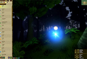
Flares
This is a tiny but neat feature which simply uses Unity's flare system. The sun now has flares and also every other light source can have flares. You can choose from various presets.
IMG:https://stuff.unrealsoftware.de/pics/s3dev/flares_pre.jpg

> Light entity with a flare in the map editor


Flowers
After adding butterflies in the last dev blog, I really felt like adding some new flowers.

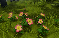
Hibiscus: I already drew the blossom a while ago. It's also used as UI decoration. The leaf texture was still missing though and there was no real model yet. I took care of that now.
IMG:https://stuff.unrealsoftware.de/pics/s3dev/models/hibiscus_pre.jpg

> Hibiscus


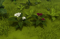
Zantedeschia: Also called calla or calla lilly. This one is completely new. I made two different color variants.
IMG:https://stuff.unrealsoftware.de/pics/s3dev/models/zantedeschia_pre.jpg

> Zantedeschia


Extremely important key features aka wasting time with nonsense: Destruction FX UV filter
When destroying objects, Stranded III decomposes the meshes into their parts (connected vertices) and converts these into short living physics objects so it looks like the objects fall apart. This is also true for the new hibiscus flowers. I want people to be able to collect hibiscus blossoms (not sure what they will be good for. Maybe tea?). So the plant spawns hibiscus blossom items when it get destroyed. This looks weird though because the blossoms are part of the mesh. So for a few seconds there are simply too many blossoms - the spawned items and the original blossoms of the mesh.

I actually already have a filter in place which allows me to only generate parts from (sub)meshes wich use a specific texture. Unfortunately I can't use that for the hibiscus plant because it uses a single texture sheet for all its parts (which is also shared with a lot of other small plants by the way).

Therefore I introduced a new filtering method: UV checks! You can now define ranges of UV coordinates. Those are the X and Y coordinates in textures from bottom left (0,0) to top right (1,1). The game will then only spawn mesh parts if none of their UVs is inside or outside a specified UV range (hence rectangle). This way I can prevent that the blossom destruction meshes are spawned and can instead spawn the blossom items. Hooray!

Game Recommendation: Oxygen Not Included
This game is wild. It was recommended to me because it's kind of a survival game (your people need food, oxygen, the right temperature, toilets...) but I think it's mainly a building & management game. And it's ridiclously complex. It seems simple at first but after a short time you realize that it comes with a complex gas, liquid, temperature and even germ and electricity simulation. You have to take good care of all of these things or your people will die sooner or later. You have to build smart ventilation systems, piping and your own electric grid which hopefully doesn't overheat every few seconds. And it doesn't end there: You can even have automation stuff which turns things on and off automatically based on sensors and logical conditions.

So if you're looking for a challenge and have enough time: play it!

old Dracaena & Lockpicking

DC
Admin Off Offline

Quote
Dracaena
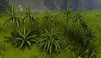
I made 7 Dracaena variants. I hope they help me to make the jungle look more dense!
IMG:https://stuff.unrealsoftware.de/pics/s3dev/models/dracaena_pre.jpg

> Dracaena Variants


Lockpicking
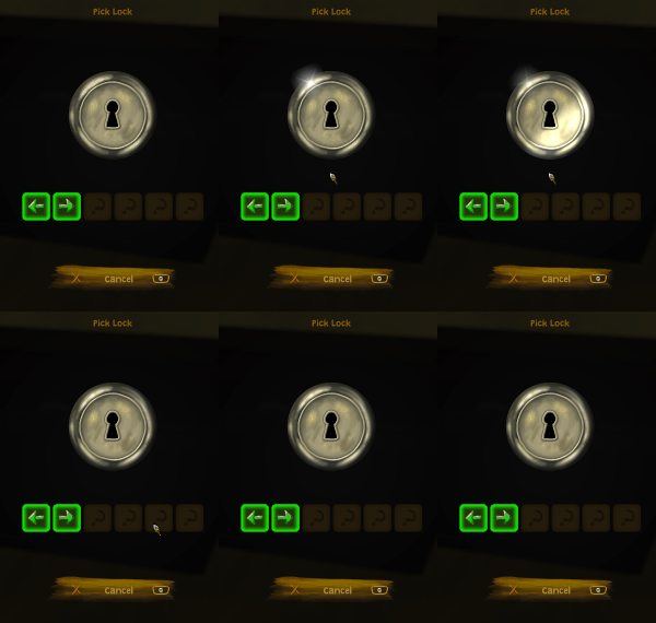
There will be some situations were you have to pick locks in the game. I now implemented UI for this. Picking locks works by entering the right sequence of left/right/up/down arrows. If you fail you have to start again from the beginning so it's also about remembering the sequence. Since the chance of hitting the right key is quite low when having 4 options I will probably limit it to just left/right in most cases. Otherwise it could be quite frustrating.
IMG:https://stuff.unrealsoftware.de/pics/s3dev/picklock.gif

This gif only shows the shiny effect on the lock but there are some more animations. When you fail the lock will turn left and right a few times like head-shaking and if you succeed it will go up and down like it's nodding.

Chest
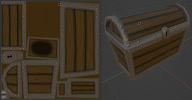
...and of course if I implement lockpicking there also needs to be some kind of lock you can pick. So I created a chest model. This one was much more work than expected and I'm not very happy with the result but that's okay.
IMG:https://stuff.unrealsoftware.de/pics/s3dev/models/chest_pre.jpg

> Chest


Note that the UV grid is slightly visible on the texture in this image. Of course it won't be visible later. Also I got lazy during UV mapping and didn't perfectly use all the space on the texture. Actually there are two quads in the seemingly empty area and I just don't know where these are on the 3D model and I didn't even bother to check because the whole unwrapping process took so much time already. I'm pretty sure they aren't visible anyway and could be removed from the mesh.

A nice little detail: The lid of the chest is a separate sub mesh so it can be rotated via script. This way I can actually open the lid once the chest has been opened.
edited 1×, last 09.04.24 08:26:39 pm
To the start Previous 1 2 3 4 5 6 Next To the start
Log in to replyProjects overviewForums overview